Rebranding a traditional B2B company
for global modern market trust.
Problem
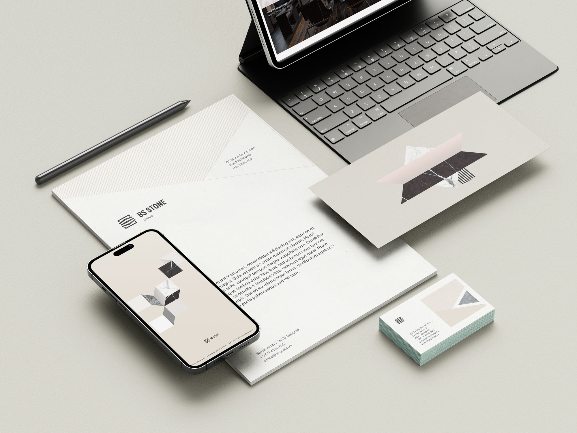
A full rebrand of an EU architectural stone trader, repositioned for the international market through a complete brand system, art direction, and digital presence.
Results
International market visibility , foreign clients started noticing them. Active sales into the Chinese market through a new partnership secured after the rebrand.
Testimonial
“Great experience, Nikola was patient, professional and thorough. After a couple of discovery sessions, he moved quickly to deliver a coherent brand experience based on the insights we provided, our goals and his creative vision. “
Services
Brand Strategy, Brand Identity, Brandbook, Branding, Website, Signage
What wasn’t working for the client
Visual identity was outdated and out of step with European architectural stone market standards, one of the most aesthetically demanding industries in the world. The brand looked local in a market that buys with its eyes first. International clients weren’t taking them seriously before the conversation even started.
What pushed them to finally get help
European expansion was the goal, but the brand was the barrier. Every time they approached a new international client or partner, the identity was working against them before anyone said a word. They needed to look like they belonged in that market before they could sell in it.
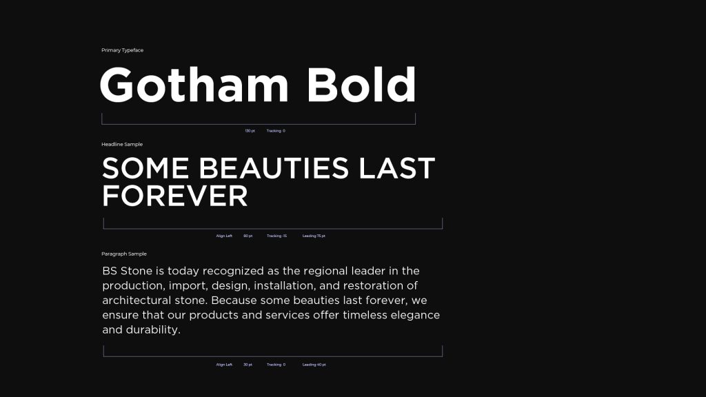

Full brand strategy and repositioning first, defining where BS Stone fits in the European architectural stone market, what they stand for, and what their visual and verbal language needed to communicate to international buyers. Then complete visual identity system built to European luxury/architectural standards, not to look “nicer” but to signal credibility at the level the market expects.
Artistic approach drove everything, stone as material has texture, weight, permanence. The brand had to feel that way too.